Sunday, January 27, 2008

Kind of looks like Arial to me. But it ain't. Toronto Street Signs

Kind of looks like Arial to me

It's not. It's Helvetica, but the angle on the end of the bottom curve of the 'e' is sort of half way there. Whatever... It's a different cut of Helvetica than I'm used to. And I am used to Helvetica.

Toronto street name signs.
Toronto is in the process of changing the typeface on street signage to ClearviewHWY.

I had planned to be taking photos of old and new Toronto Street name signs, but it's winter. It gets dark early. I'll wait until the day are a bit longer. Mean time there are other fish to fry. Retro reflectivity might be a good topic.

Overall, this blog may appear to be promising to be very boring. Not so, friends. Not so. A least not to the keen observer of those things that are so ubiquitous as to go virtually unnoticed. The excitement is slow to build. I'll give you that.

In the future I'll post the bulk of images to Flickr, with a link, rather than post a series of images in the blog. Or with a link to Google's Picas, which isn't as good, or as popular with the cool kids and real cognoscenti, but allows a larger amount of storage space. We just canceled our Rogers account, and it my Flickr quota got slashed back to 200 images. Or else, I will make my own slide show and host them myself.

R

Friday, January 18, 2008

Exploring my own back yard.

So to speak.

We'll do a little "back yard" exploring around my neighbourhood in Richmond Hill, near Carville Road, between Yonge and Bathurst.

So, a walk from our house to Burr House Crafts Gallery, which is is visible from our living room window, looks like this to a Typophile.


The house number must go. I'll be making a new one when it warms up a bit. I'm thinking Carved Oak, with gold leaf. (Well brass leaf, actually but, Shh. that's our secret)


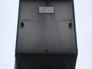
Water shut-off valve.


D NG R


Caution, I think. A retaining wall is falling down... It's quite hazardous


So they put up some caution tape.


(Thank goodness)


Our house from Burr House.


Broken 3


x


Mmm - Crafts...


Ice in the creek.

Saturday, January 12, 2008

to get started. It's like the wild west out there

Signs define our built environment more than architecture. This may be news to architects, but it shouldn't be. In the same way that dirty clothes, yesterday's newspaper and and dusty brick-a-brack clutter up those unlived-in rooms from Better Homes and Gardens once the cameras are gone, signage clutters up the streetscape. Open your eyes. What do you see? Signs! You see signs.

That's not necessarily a bad thing. It's people communicating. We do that. Quite a lot, actually. More than we need to. Of course, there are hierarchies of communication. Some times it can be a very important message that you must read. Sometimes, it's just senseless, unwelcome noise someone is rudely pushing in you face.

Some signs are well designed and well made. Others are not - It would be a kindness to suggest they were designed at all and, if "well made" means they don't fall down, then, they are for the most part, well made.

I design signs for a living and before that I made signs. The signs I design are no-nonsense wayfinding, regulatory and information signs. In my job, I try to communicate as clearly and concisely as possible. I'm not here to say I do it well - Just that that's my objective. I have spent a considerable amount of time researching relative legibility of various typefaces. Here, in this blog, I am more interested in finding out at what point a sign fails to communicate, and how. Or how it may communicate in some unintended way.

All images will be mine. I'm an artist, so some of them will be drawings of signs.

This sign for Hoo Lee Garden(s) in Coburg Ontario, is a lovely example to start with. It has aged well and I like it.